As we step into 2024, the world of interior design ushers in a refreshing palette of colors that promise to redefine our spaces. As companies are starting to unveil their colors of the year, we have chosen a few of our favorites from renowned paint companies: Sherwin-Williams, Behr, Benjamin Moore, and Dutch Boy. Let’s delve into these shades and explore how they can transform our living and working environments.

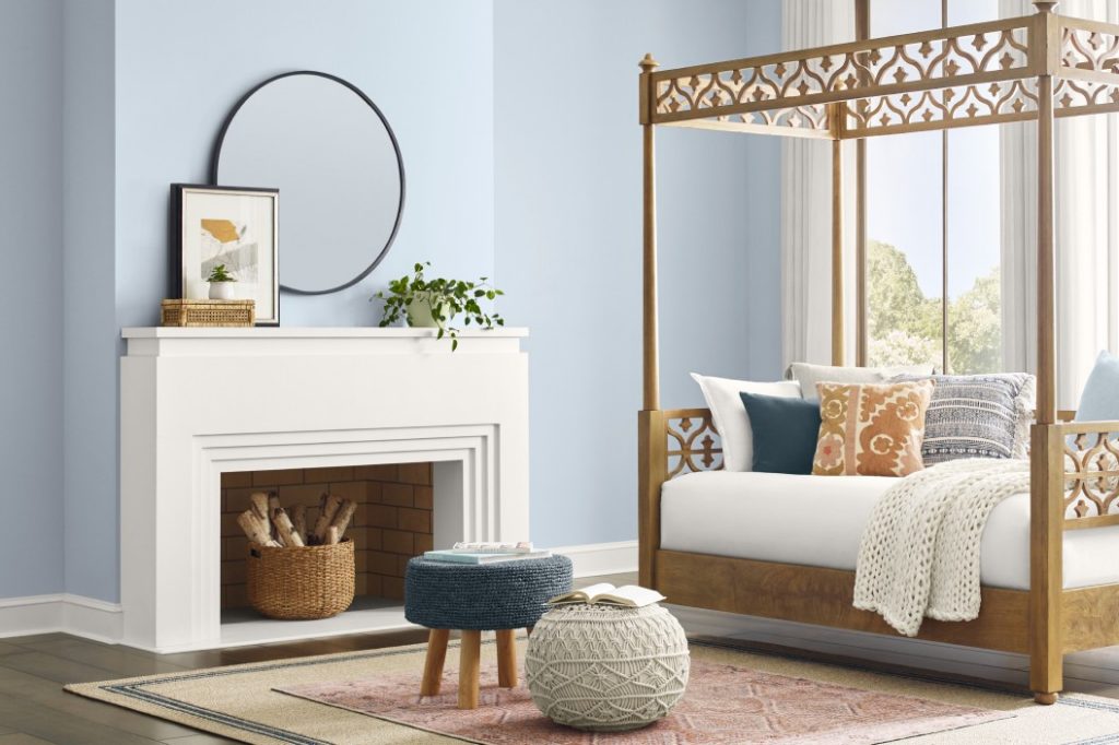
Upward by Sherwin-Williams
First on our list is “Upward” by Sherwin-Williams, a color that embodies optimism and serenity. This soft, airy blue brings to mind a clear, open sky, providing a sense of expansiveness and tranquility. In a world that’s constantly on the move, “Upward” offers a calming presence. Its lightness makes it perfect for creating a relaxed atmosphere in bedrooms or living rooms, promoting mental clarity and peace.
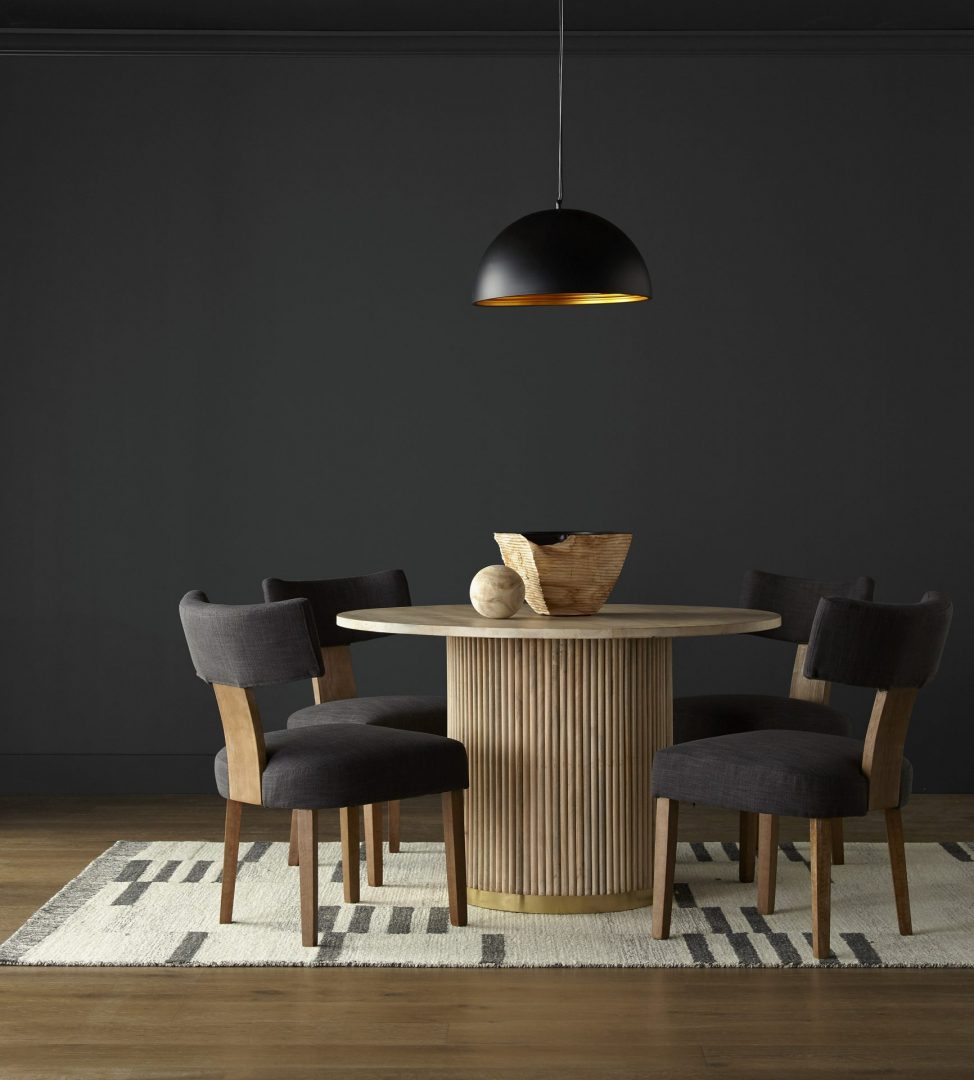
Cracked Pepper by Behr
Behr’s choice, “Cracked Pepper,” presents a bold contrast. This deep, almost charcoal gray exudes sophistication and strength. It’s a color that makes a statement without overwhelming, perfect for accent walls or furniture pieces. In spaces like home offices or libraries, “Cracked Pepper” can foster focus and decisiveness, reflecting a sense of professionalism and confidence.

Blue Nova by Benjamin Moore
Benjamin Moore takes us to a different spectrum with “Blue Nova,” a vibrant yet soothing shade. This color balances between being lively and calming, making it versatile for various settings. “Blue Nova” is like a breath of fresh air in any room, bringing in a splash of cheerfulness while maintaining an aura of tranquility. It’s ideal for spaces where creativity and relaxation go hand in hand, like art studios or casual lounges.
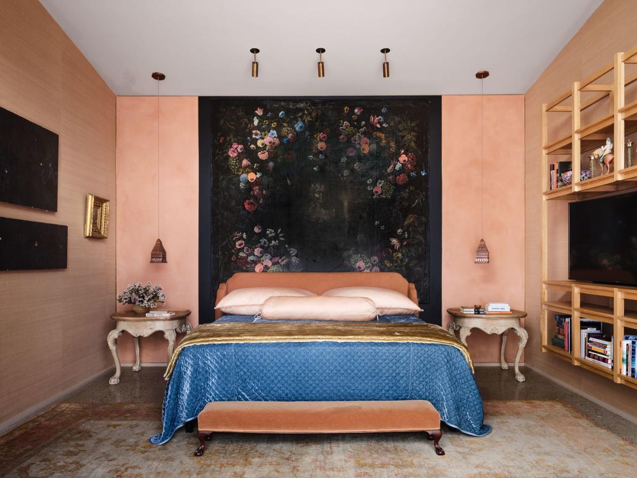
Peach Fuzz by Pantone
Just announced, Peach Fuzz by Pantone is as fresh as the color presented. PANTONE 13-1023 Peach Fuzz captures our desire to nurture ourselves and others. It’s a velvety gentle peach tone whose all-embracing spirit enriches mind, body, and soul. According to Leatrice Eiseman, executive director of the Pantone Color institute, “In seeking a hue that echoes our innate yearning for closeness and connection, we chose a color radiant with warmth and modern elegance. A shade that resonates with compassion, offers a tactile embrace, and effortlessly bridges the youthful with the timeless.”
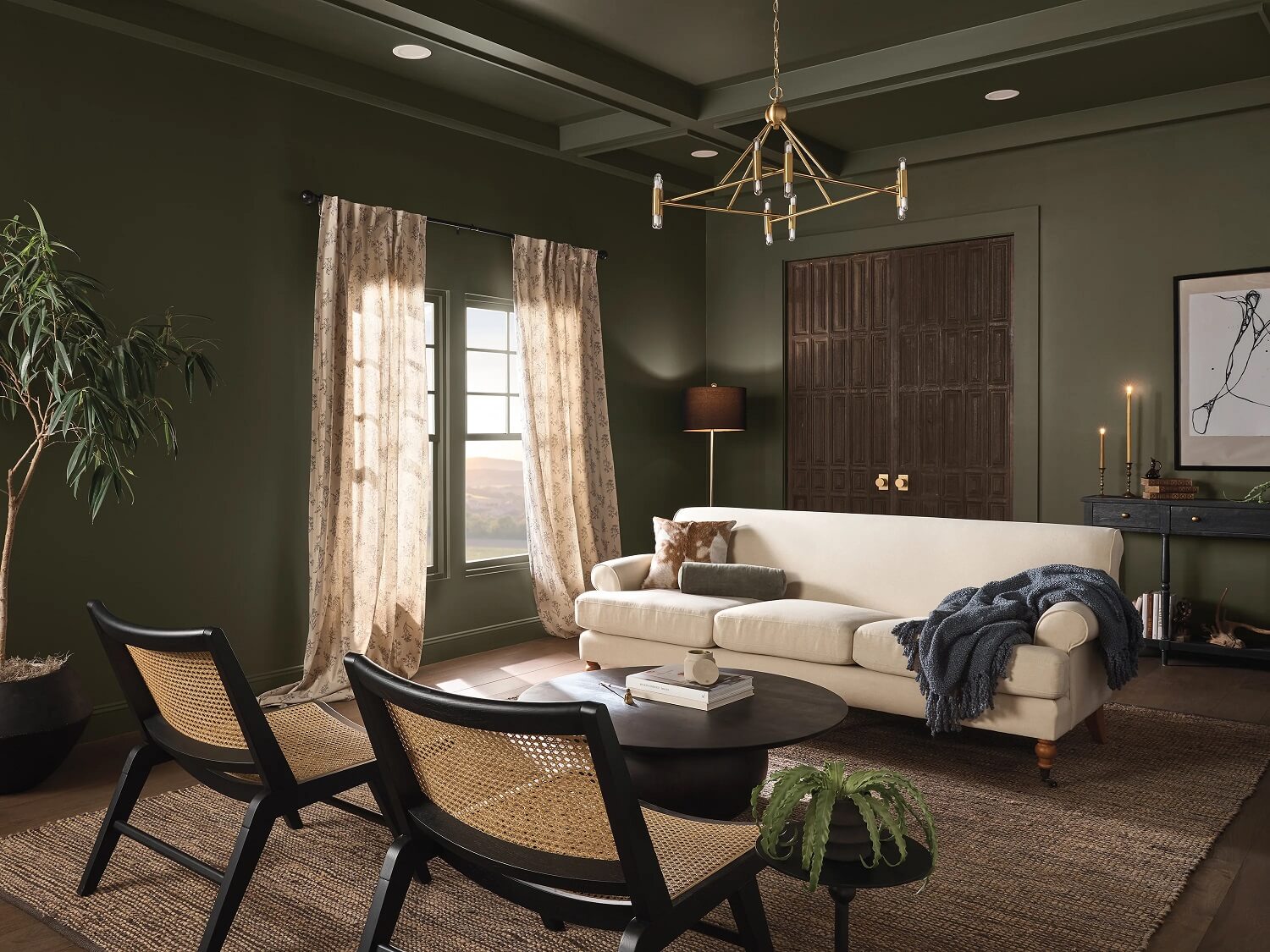
Irsonside by Dutch Boy
Finally, Dutch Boy’s “Ironside” is a robust, earthy tone that grounds us. Reminiscent of natural iron ore, this color offers a sense of stability and resilience. It’s a perfect backdrop for spaces that aim to be both comforting and strong, like family rooms or kitchens. “Ironside” pairs well with natural materials like wood or stone, enhancing the feeling of being connected to the earth.
