Transforming Senior Living: The Bridges of Parkview

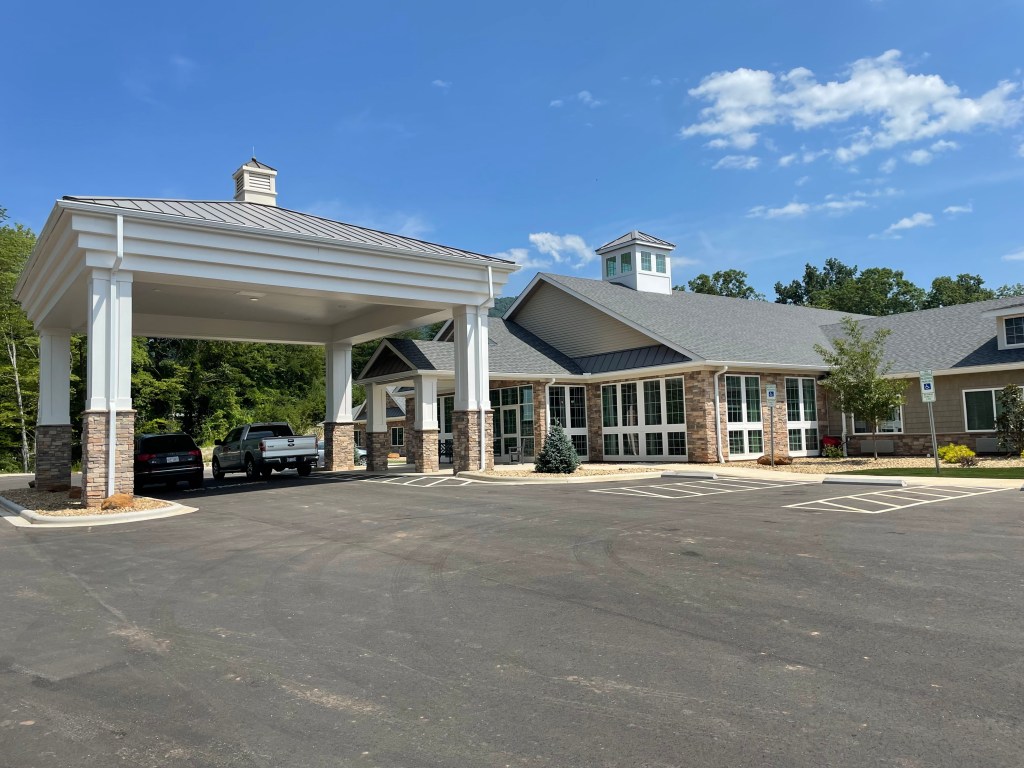
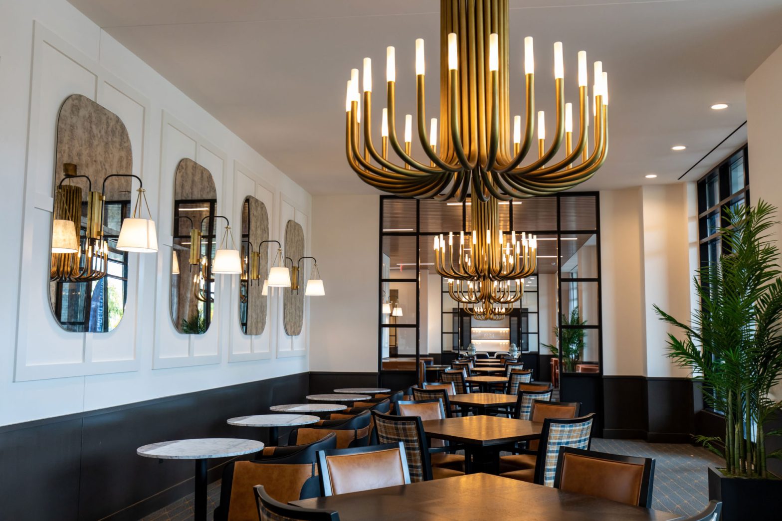
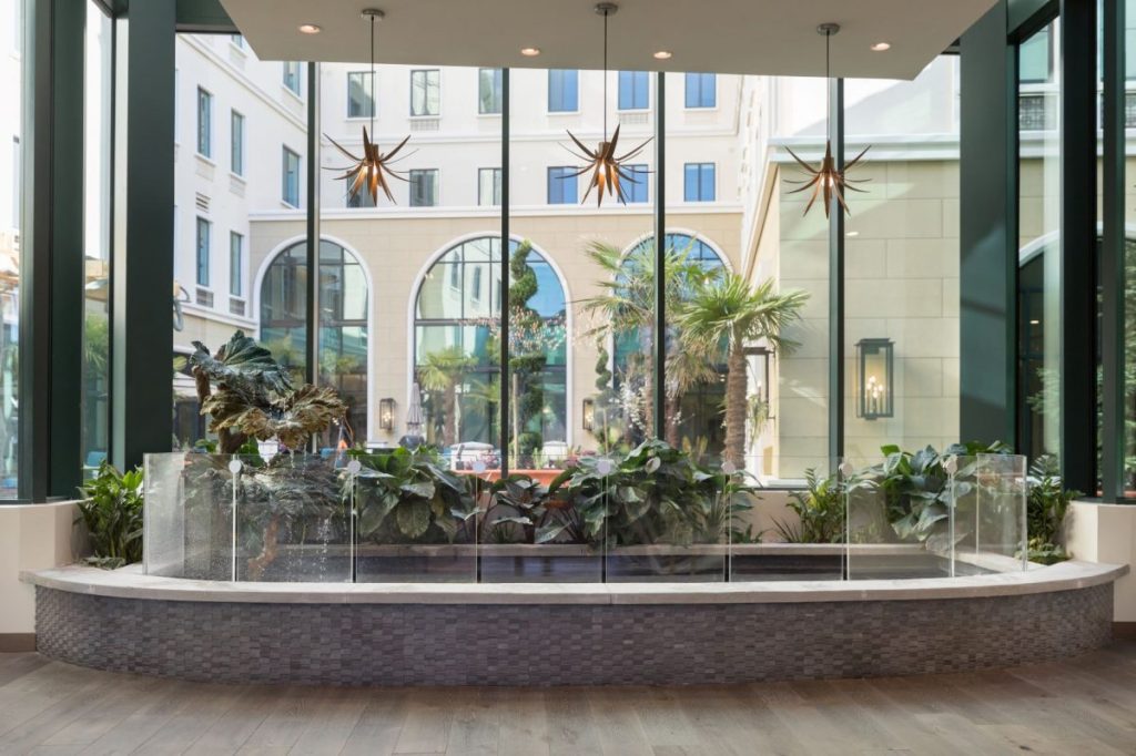
Nestled in the heart of Henderson, North Carolina, The Bridges of Parkview stands as a beacon of comfort and care for seniors in need of assisted living and memory care services. Recently, the facility underwent a remarkable transformation from our design team. We infused warmth and beauty into every corner.

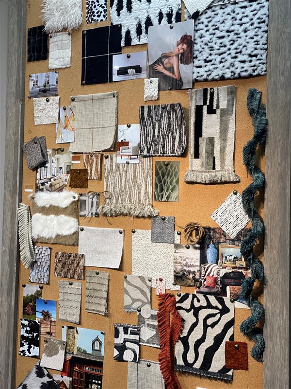
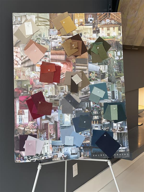
The design process was extensive, spanning several months of planning and coordination. From initial concept development to final execution, every detail was carefully considered to create an environment that would enhance the well-being of the residents.

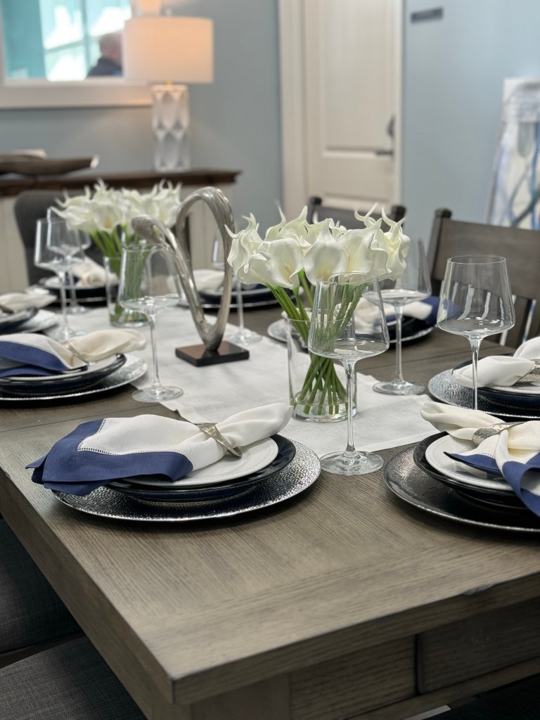
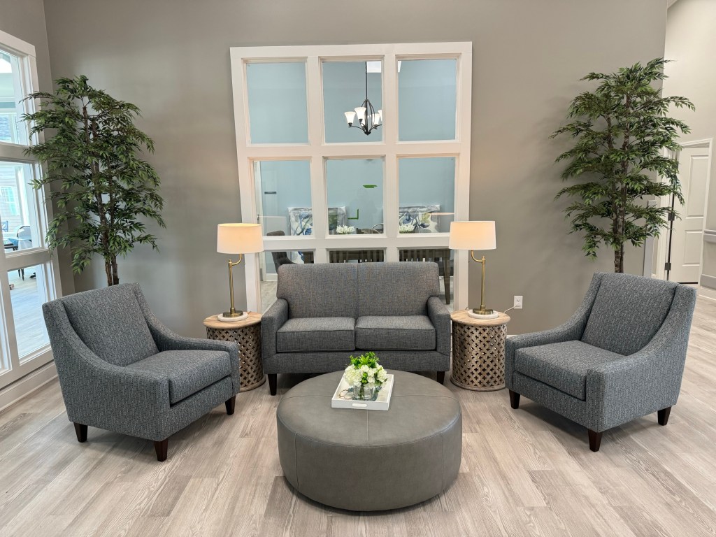
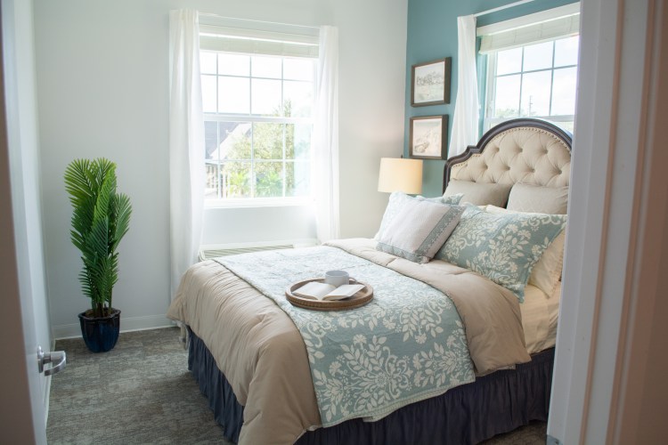
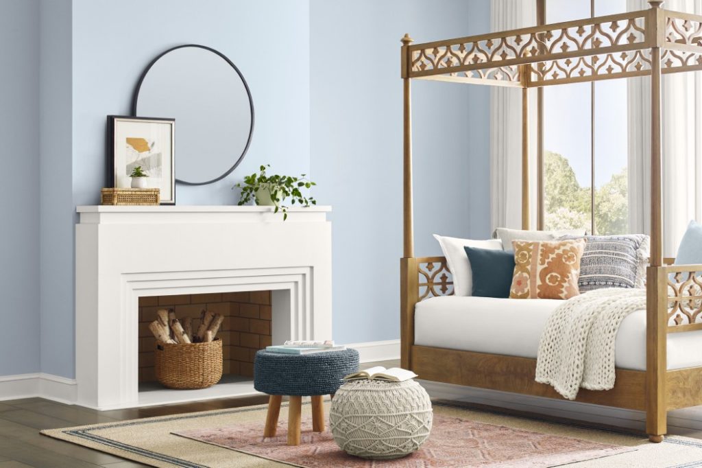
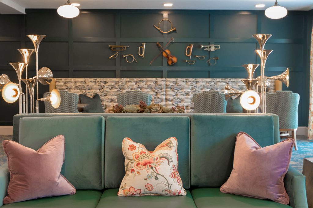
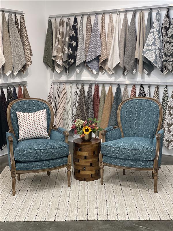
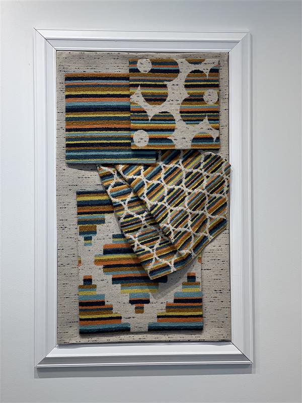
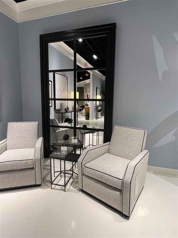
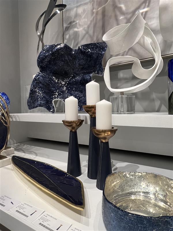
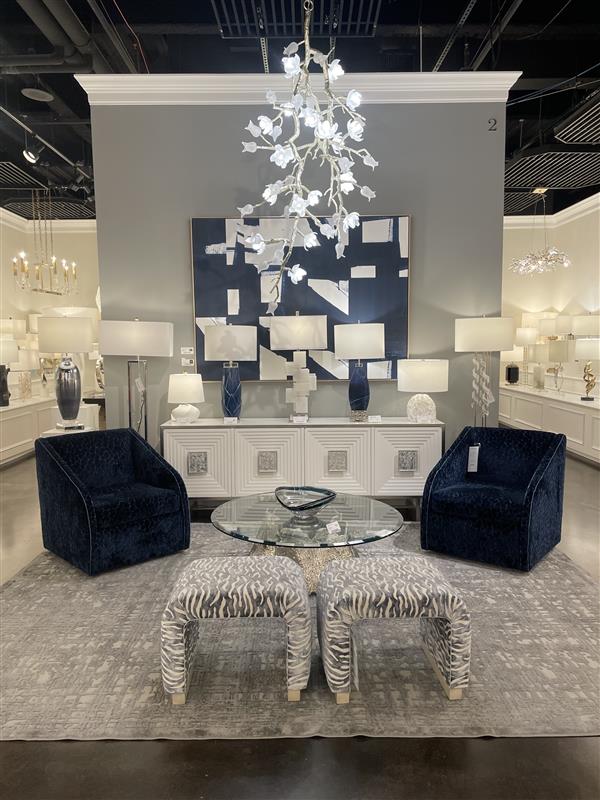
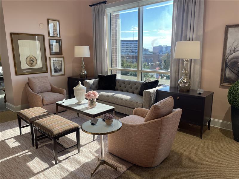
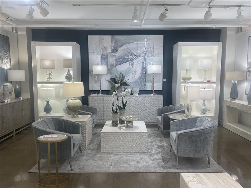
One of the key elements of the design was the careful selection of colors, with tones of blue taking center stage to soothe and calm the residents. These soft hues were chosen to create a serene and tranquil atmosphere throughout both the assisted living and memory care sides of the facility.

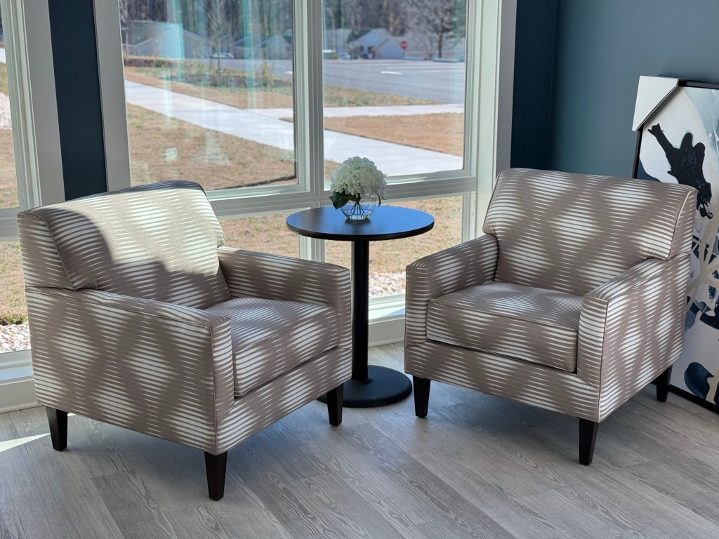
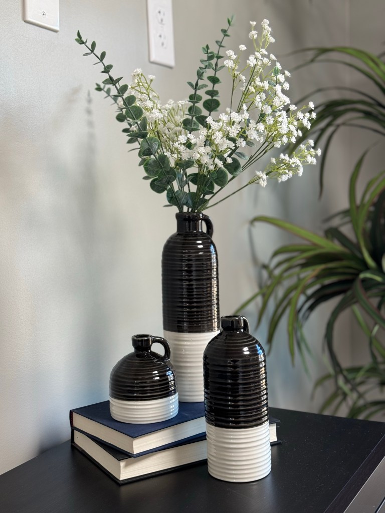
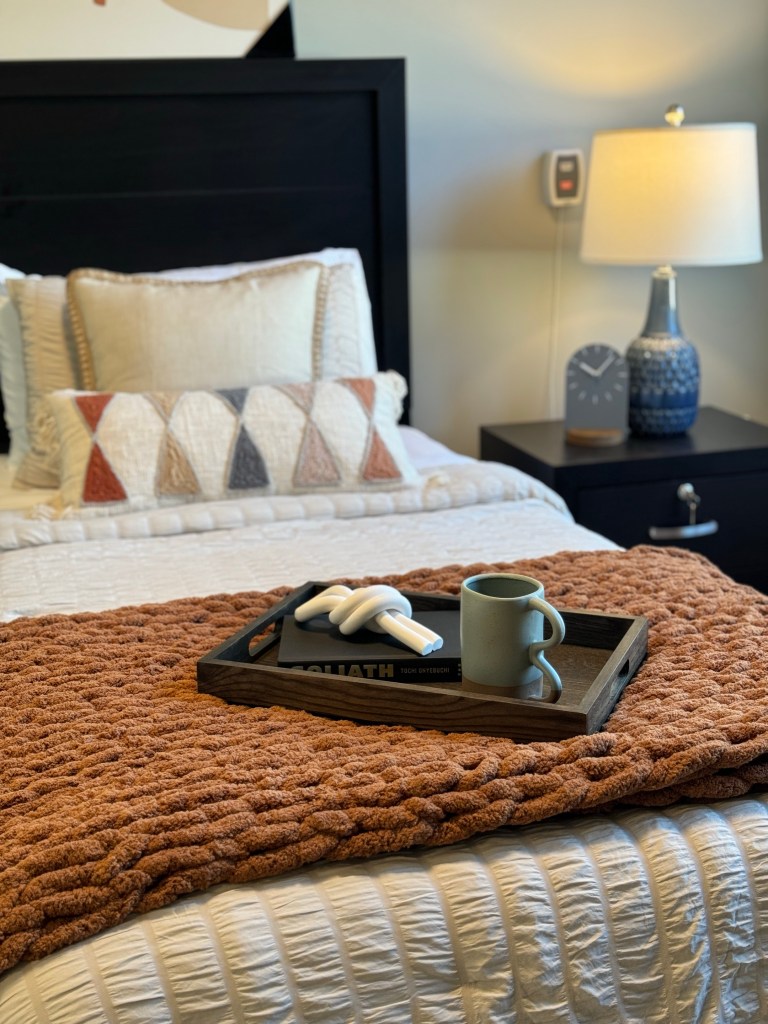
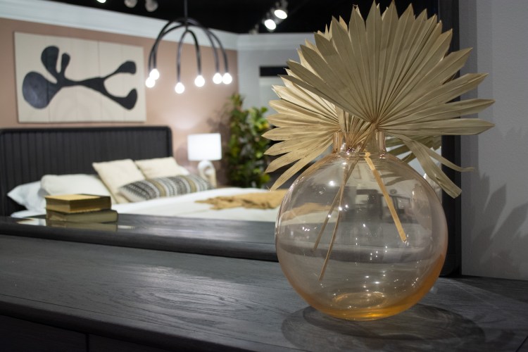
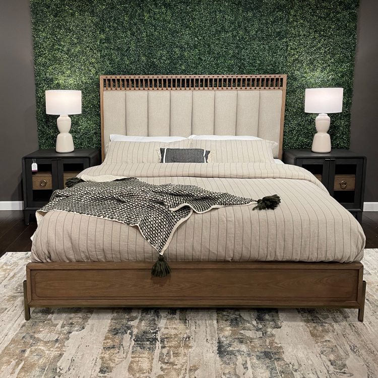
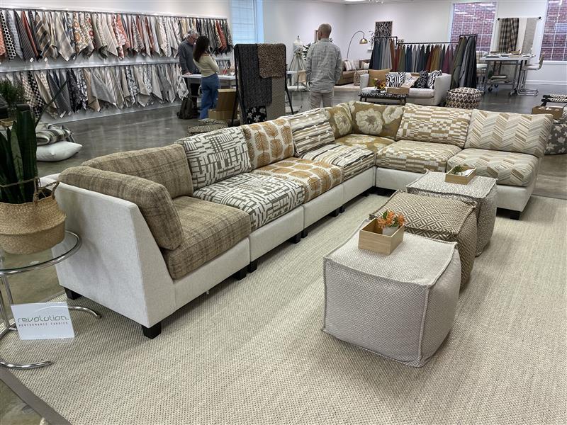
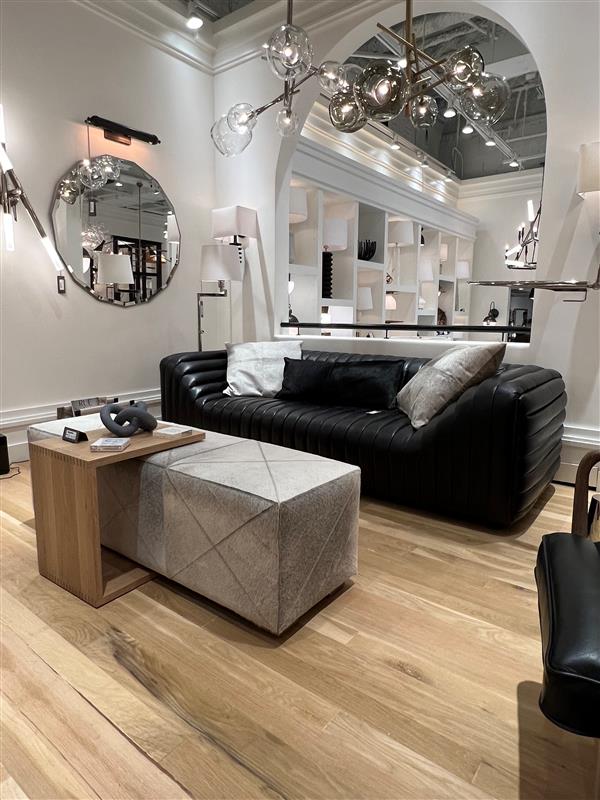
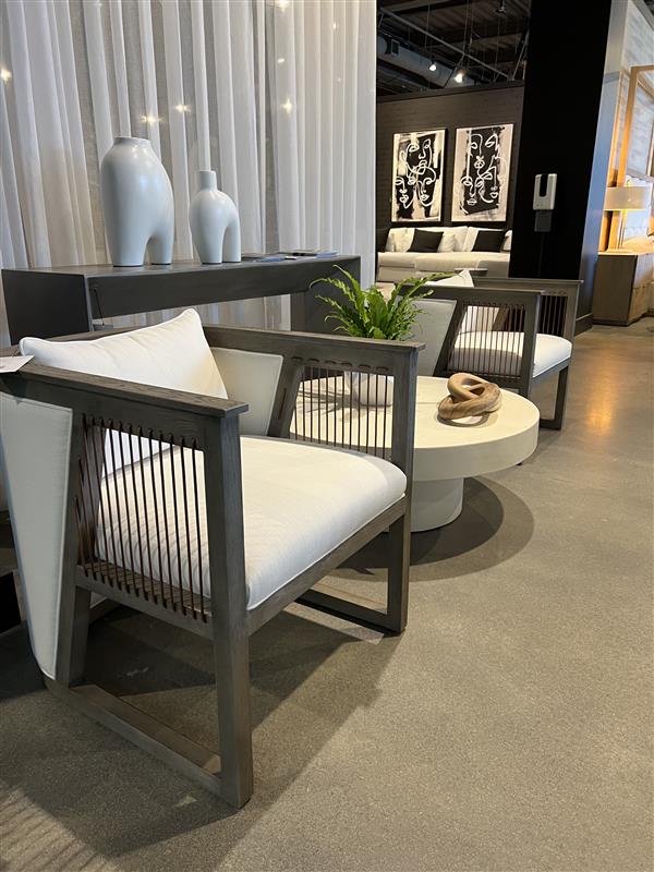
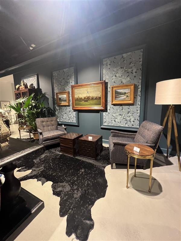
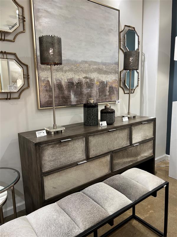
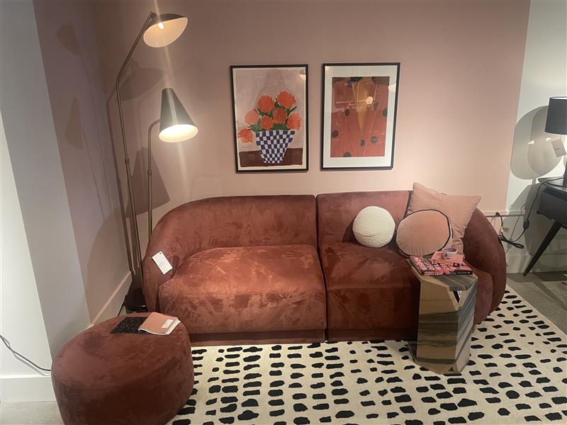
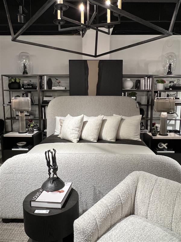
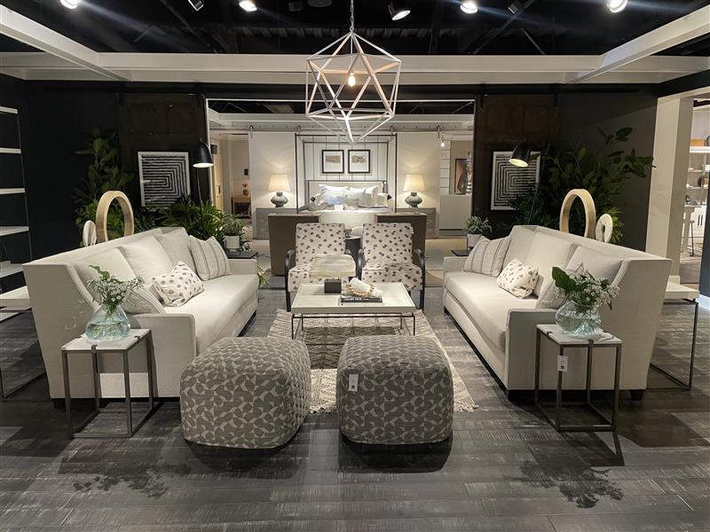
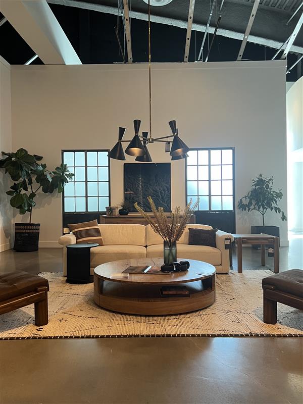
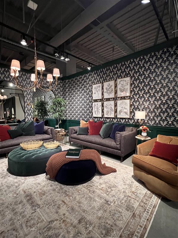
Furniture selection was guided by a commitment to comfort, durability, and accessibility, with upholstery in shades of blue adding to the overall calming effect. From plush sofas to ergonomic chairs, every piece was chosen with the residents’ well-being in mind, creating inviting spaces where they could relax and unwind.

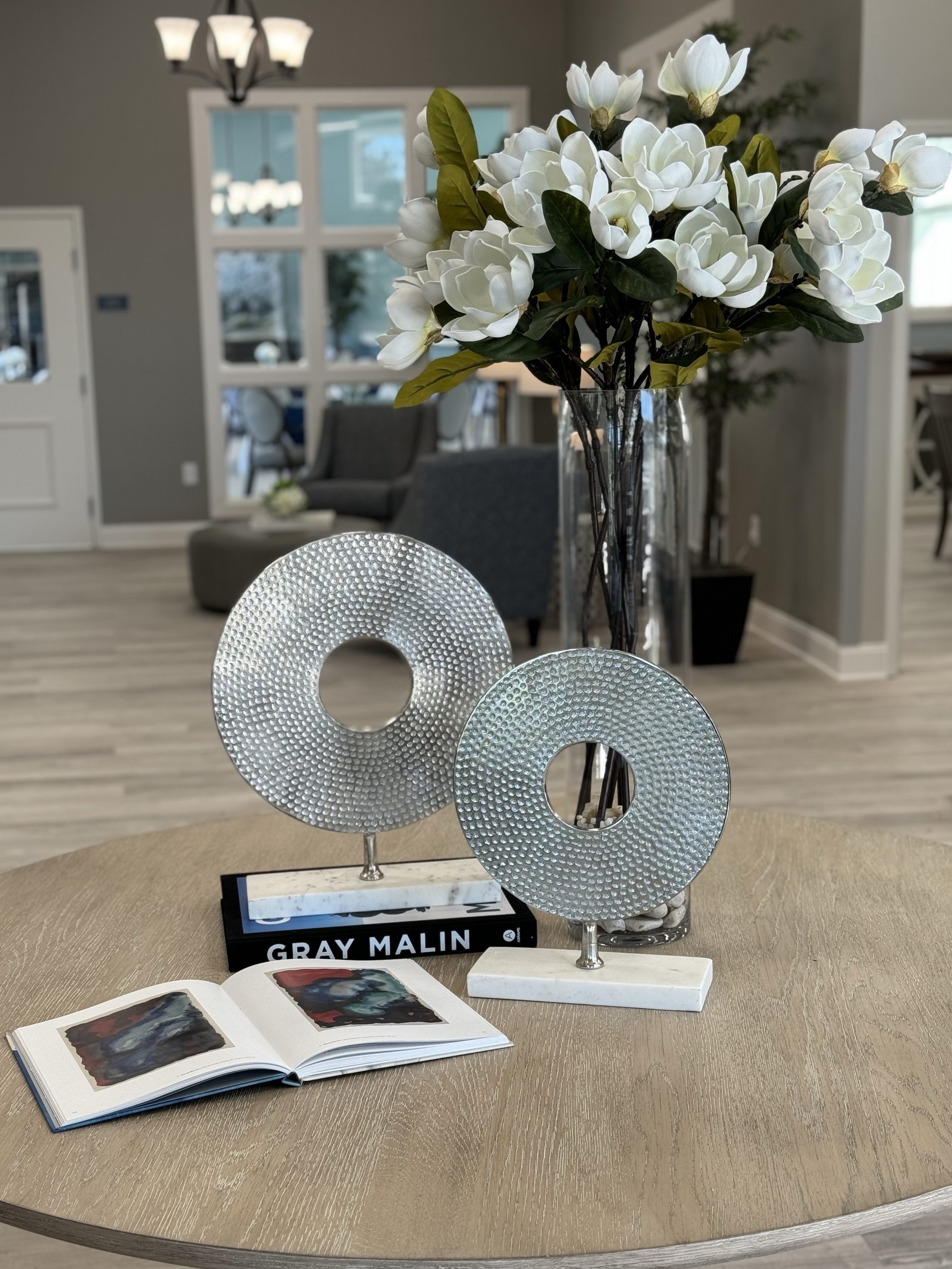
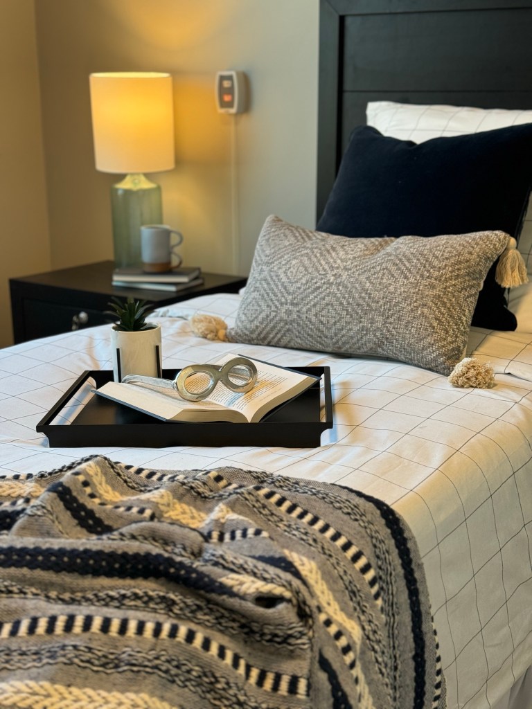
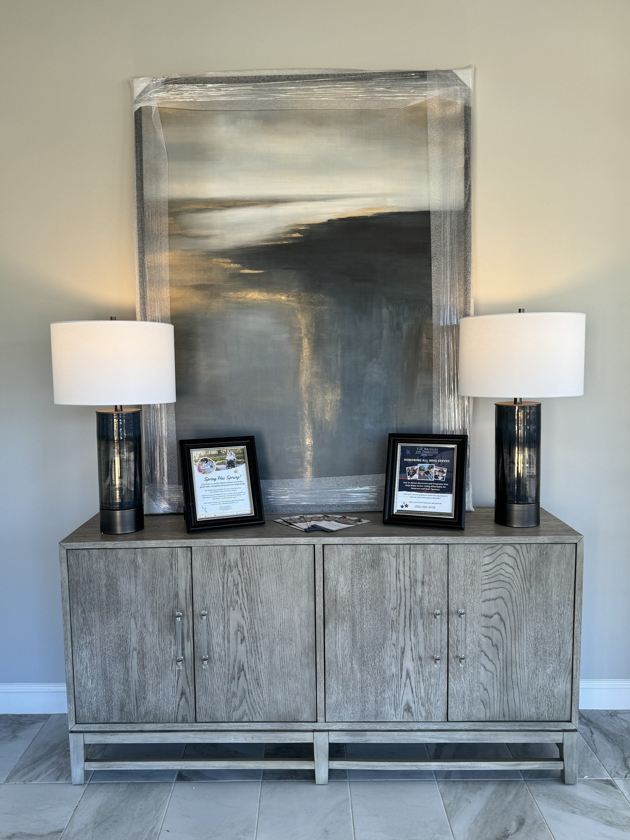
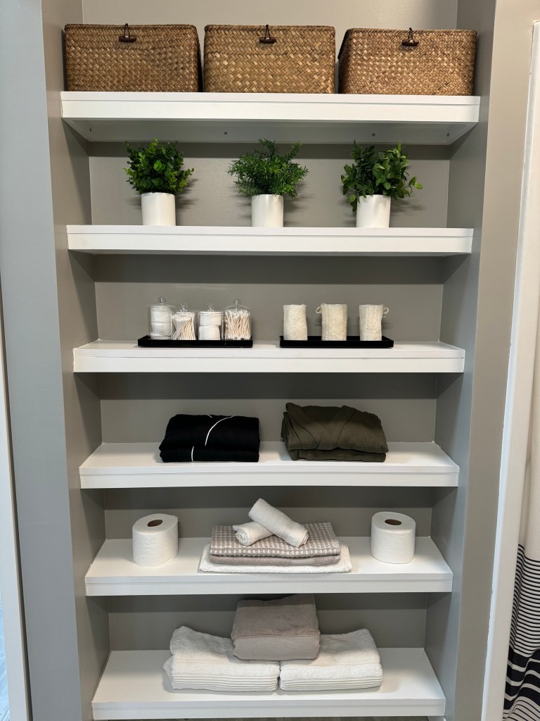
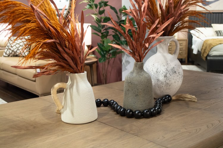
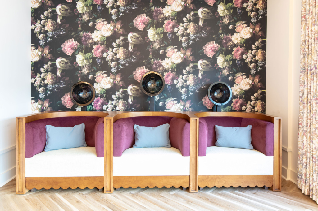
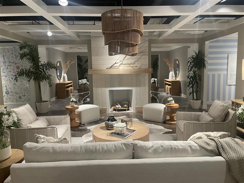
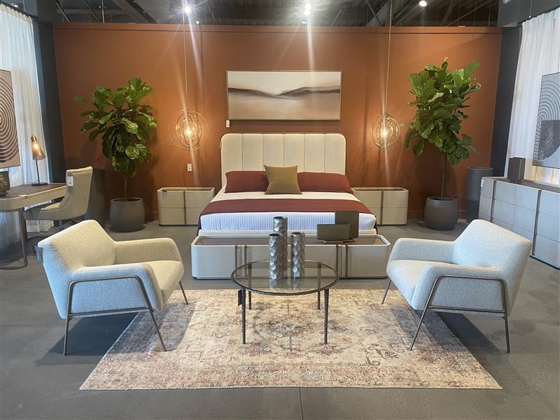
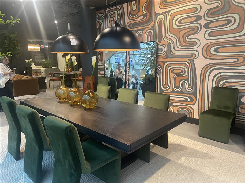
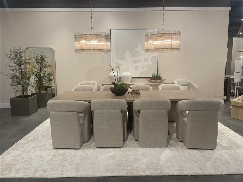
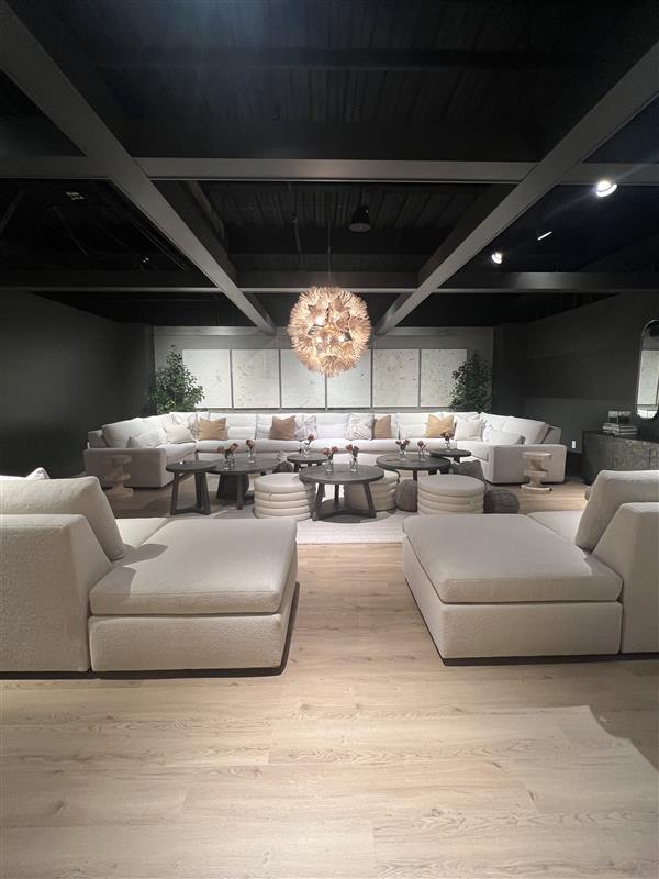
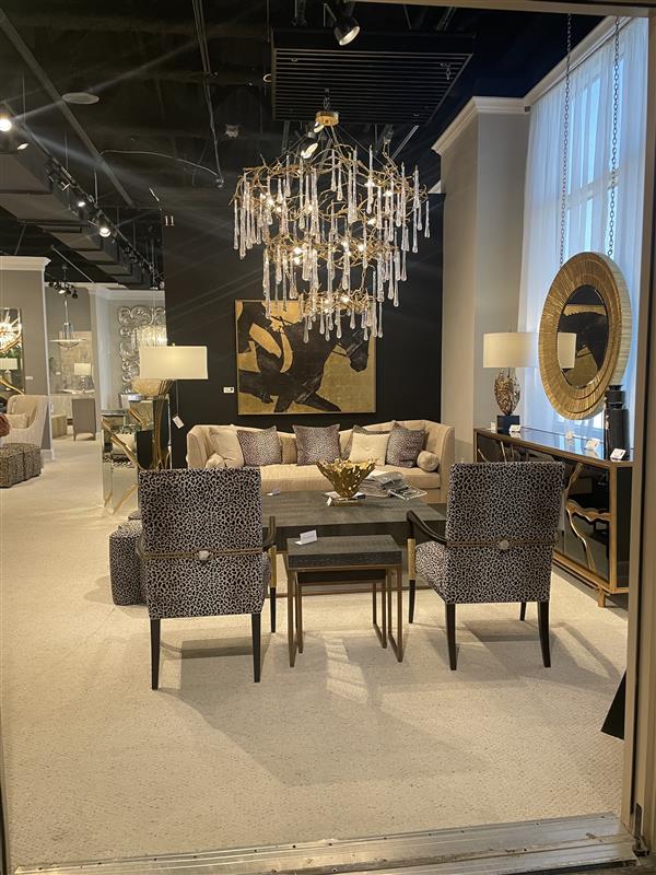
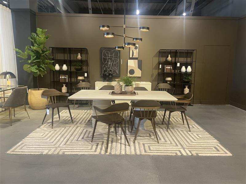
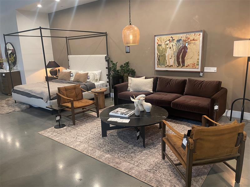
While the design process took months, the time it took to install everything into the facility was condensed into a single week of intensive work. The design team tackled a variety of spaces within the facility, including model rooms, dining areas, activity rooms, living spaces, a beauty room, and even a theater. Each area was transformed with careful attention to detail, creating inviting spaces where residents could feel at home and at peace.

In the end, the result was more than just a visually appealing space—it was a testament to the power of thoughtful design to enhance the lives of seniors. As the final touches like artwork and drapery come together in the next few weeks, the Bridges of Parkview now stands as not only a place of care but also a place of comfort, beauty, and community for all who call it home.

A Year in Review: Looking Back and Forward

As the year is winding down, our team is reflecting on where we’ve been, what we’ve done, and where we want to go in 2024.

Where we’ve been…

New year, new team! January 2023 kicked off the search for two new Jr. Designers, and ultimately were found in the talented Zahria King and Chelsea Ferguson.

Starting off the summer season strong, we accomplished our first install as a team in Lake Lure, North Carolina. Nestled in the picturesque Smokey Mountains, The Landings of Lake Lure is more than just an assisted living facility; it’s a home that merges comfort with the serene beauty of its surroundings. Being that this was the first install with the three of us together, there were lots of learning curves, but we made it beautiful!

Heading into fall, our team’s momentum didn’t just continue—it soared. We embarked on a whirlwind journey, completing two more distinct installs across the eastern seaboard, one being a memorable project in Orlando, Florida. Each location presented its own set of challenges and opportunities, allowing us to flex our creative muscles in new and exciting ways.

Amidst these projects, we also undertook the colossal task of planning, procuring, and executing a showroom design for our sister company, Bernard’s Fall Furniture Market showcase.

As we moved out of the fall season, our team reflected on these experiences with pride. Each project, no matter the scale, was a step forward in our journey, broadening our horizons and sharpening our skills. We’re not just designing spaces; we’re crafting experiences, and each success brings with it the anticipation of even more exciting opportunities in the future.

Where we’re going:

Looking forward, our team hopes to accomplish many things in the new year. Workplace designs have been planned, spring market ordered, and lots of senior living facilities are coming! Were excited at the fresh opportunities being presented and hope to grow our design capabilities in the new year!


Setting the Tone: A Look at Colors of the Year for 2024

As we step into 2024, the world of interior design ushers in a refreshing palette of colors that promise to redefine our spaces. As companies are starting to unveil their colors of the year, we have chosen a few of our favorites from renowned paint companies: Sherwin-Williams, Behr, Benjamin Moore, and Dutch Boy. Let’s delve into these shades and explore how they can transform our living and working environments.

Photo Credit: Sherwin-Williams

Upward by Sherwin-Williams

First on our list is “Upward” by Sherwin-Williams, a color that embodies optimism and serenity. This soft, airy blue brings to mind a clear, open sky, providing a sense of expansiveness and tranquility. In a world that’s constantly on the move, “Upward” offers a calming presence. Its lightness makes it perfect for creating a relaxed atmosphere in bedrooms or living rooms, promoting mental clarity and peace.

Photo Credit: Behr

Cracked Pepper by Behr

Behr’s choice, “Cracked Pepper,” presents a bold contrast. This deep, almost charcoal gray exudes sophistication and strength. It’s a color that makes a statement without overwhelming, perfect for accent walls or furniture pieces. In spaces like home offices or libraries, “Cracked Pepper” can foster focus and decisiveness, reflecting a sense of professionalism and confidence.

Photo Credit Benjamin Moore

Blue Nova by Benjamin Moore

Benjamin Moore takes us to a different spectrum with “Blue Nova,” a vibrant yet soothing shade. This color balances between being lively and calming, making it versatile for various settings. “Blue Nova” is like a breath of fresh air in any room, bringing in a splash of cheerfulness while maintaining an aura of tranquility. It’s ideal for spaces where creativity and relaxation go hand in hand, like art studios or casual lounges.

Photo Credit: Lake | Flato Designs

Peach Fuzz by Pantone

Just announced, Peach Fuzz by Pantone is as fresh as the color presented. PANTONE 13-1023 Peach Fuzz captures our desire to nurture ourselves and others. It’s a velvety gentle peach tone whose all-embracing spirit enriches mind, body, and soul. According to Leatrice Eiseman, executive director of the Pantone Color institute, “In seeking a hue that echoes our innate yearning for closeness and connection, we chose a color radiant with warmth and modern elegance. A shade that resonates with compassion, offers a tactile embrace, and effortlessly bridges the youthful with the timeless.”

Photo Credit: Dutch Boy Paints

Irsonside by Dutch Boy

Finally, Dutch Boy’s “Ironside” is a robust, earthy tone that grounds us. Reminiscent of natural iron ore, this color offers a sense of stability and resilience. It’s a perfect backdrop for spaces that aim to be both comforting and strong, like family rooms or kitchens. “Ironside” pairs well with natural materials like wood or stone, enhancing the feeling of being connected to the earth.

Timeless Comfort: The Latest Senior Living Design Trends for a Graceful and Modern Retirement Lifestyle

Photo Credit: Banko Design

As the golden years unfold, so do innovative approaches to senior living design, ushering in a new era of comfort, style, and functionality. In this blog post, we explore the latest trends shaping the landscape of senior living spaces, creating environments that not only meet the unique needs of seniors but also celebrate their individuality.


Photo Credit: Banko Design

Harmonious Blend of Form and Functionality:

Architects and designers are seamlessly integrating practical features with aesthetic appeal. From ergonomic furniture to multifunctional spaces, the emphasis is on creating homes that cater to the evolving needs of seniors without compromising on visual elegance.

Photo Credit: Aegis Living

Nature-Inspired Sanctuaries:

Explore the rise of biophilic design in senior living communities. We delve into how incorporating elements of nature, such as indoor gardens, natural light, and outdoor spaces, not only enhances the ambiance but also contributes to the overall well-being of residents.

Photo by RDNE Stock project on Pexels.com

Technology Integration for Enhanced Living:

Smart home technology is revolutionizing senior living. From voice-activated assistants to sensor-driven safety features, see how these advancements are empowering seniors to live independently while staying connected with their surroundings.

Photo Credit: Banko Design

Personalization and Individual Expression:

Learn how the shift towards person-centered design is allowing seniors to express their unique personalities. Whether through customizable living spaces or communal areas that reflect diverse interests, senior living communities are embracing individuality and fostering a sense of belonging.

Photo by Mikhail Nilov on Pexels.com

Wellness-Centric Spaces:

Dive into the design philosophy centered around holistic well-being. Explore how fitness centers, meditation spaces, and wellness programs are integrated into senior living communities to promote physical, mental, and emotional health.


Exploring the Festive Elegance: Holiday Design Trends of 2023

As the festive season approaches, the world of design embraces new trends that redefine holiday aesthetics. In 2023, the trends are a unique blend of traditional charm and contemporary flair, creating a festive atmosphere that is both nostalgic and refreshingly modern.

Photo Credit: mintroom.ca

1. Nature-Inspired Themes

This year, nature-inspired themes are at the forefront. Earthy tones, including deep greens, rich browns, and warm beiges, are popular, bringing an organic feel to holiday decor. Incorporating natural elements like pinecones, branches, and dried flowers adds texture and a sense of authenticity to the decorations.

2. Sustainable and Eco-Friendly Decor

Sustainability is more than a buzzword; it’s a lifestyle choice that’s influencing holiday design trends. Eco-friendly materials like recycled paper, natural fabrics, and biodegradable ornaments are in vogue. People are opting for LED lights for energy efficiency and choosing locally sourced decorations to reduce carbon footprints.

Photo Credit: stylecurator.com.au
Photo Credit: magentamodern

3. Bold and Vibrant Colors

While traditional reds and greens are always in style, 2023 sees a rise in bold and vibrant colors. Electric blues, hot pinks, and sunny yellows are making their way into holiday decor, offering a playful and spirited vibe. These colors are especially popular in urban and contemporary settings, breaking the monotony of traditional schemes.

4. Minimalism and Scandinavian Influence

The minimalist trend continues to influence holiday decor, with Scandinavian design leading the way. This style emphasizes clean lines, simplicity, and functionality, with a color palette dominated by whites, grays, and pale woods. The result is a serene and uncluttered space that feels both modern and cozy.

Photo Credit: Haute Design London
Photo Credit: Camille Styles

5. Personalized and DIY Decorations

Personalization is a key trend, with people making decorations themselves gaining popularity. Handmade ornaments, personalized gifts, and custom-designed holiday cards are cherished for their uniqueness and the personal touch they add to the festive season.

Make a Statement this Thanksgiving: Top Tablescape Trends to Try

Photo by Karolina Grabowska on Pexels.com

Thanksgiving is an opportunity to gather with friends and family and enjoy a bountiful feast. An important part of any gathering is the presentation, and one way to make your holiday table stand out is to create a beautiful and unique tablescape. Whether you’re hosting a large gathering or an intimate meal, there are plenty of Thanksgiving tablescape trends to inspire your celebration.

Photo by RDNE Stock project on Pexels.com

Inside Out

One popular trend is to bring the outdoors in. Incorporate natural elements like greenery, wood, and stone into your table decorations. This will add a rustic, earthy look to your space. You can also add elements like pinecones, pumpkins, and gourds to further enhance the look. You can even fill a vase with fresh flowers and fall leaves for a pop of color!

Photo Credit: theperfectpallete.com

Bring on the Bling

To add a bit of sparkle to your tablescape, consider using metallic accents. Don’t be afraid to mix your metals; gold, silver, and copper are all popular choices that will add a festive look to your Thanksgiving table. You can incorporate them in the form of decorative tableware, cutlery, and even centerpieces.

Photo Credit: pizzazzerie.com

Tradition is Best

If you’re looking for something a bit more traditional, consider using classic colors like red, orange, and yellow in your table decorations. You can enhance the look with seasonal decorations like cornucopias, turkey motifs, and autumn leaves. You can also add a touch of nostalgia with vintage pieces like silver platters and crystal goblets.

No matter what look you’re going for, there are plenty of Thanksgiving tablescape trends to choose from. Whether you’re looking for a traditional or modern look, there’s something to fit any style. With a bit of creativity and some special touches, you can create a beautiful and memorable tablescape for your Thanksgiving celebration.

Happy Thanksgiving from the SVI Design Team!

Fun with Fabrics!

Fall 2023 Interwoven Textile Fair

The Interwoven textile Fair in High Point, North Carolina, is a celebration of the textile industry’s heart and soul. It’s where designers, artisans, and fabric enthusiasts converge to share a common passion. We were taken on a journey of the artistry of fabric with creative displays and trending mood boards that capture the essence of innovative design.

BRENTWOOD TEXTILES
BRENTWOOD TEXTILES
STI REVOLUTION
PMT FABRIC
RAMTEX

Upon entering the showrooms, one is immediately enveloped by the creativity of presentation. Fabrics cascade down the walls, drape over elegant furniture, and are sculpted into avant-garde forms—like the striking mannequin adorned in a tapestry of patterns and textures, embodying the fusion of fashion and fabric artistry. Each showroom is a testament to the imaginative ways textiles can transform a space. The layouts are intentional, inviting visitors to not only view but also interact with the fabrics, envisioning the endless possibilities within their own design projects.

What truly stands out across the showrooms is the prevalence of mood boards. The mood boards are not merely a collection of samples; they are a narrative. These curated collections of textures, colors, and materials offer a tangible palette of inspiration. Mood boards act as visual storytelling canvases. They show the harmonious neutrals to the bold statements of geometric patterns and organic prints. They are not just a trend; they represent a dialogue between the creator and the observer. It is a silent yet profound communication of ideas and emotions.

Not only do the boards tell a color story, but each board is also a chapter of a larger picture that these designers are painting— from sustainability or innovation to a homage to the tactile beauty of woven threads. Through them, we witness the emerging patterns of 2023, a year that promises to embrace the raw and the refined, the bold and the subtle, all interlaced in the fabric of tomorrow’s design ethos.

CULP
RICHLOOM
KING TEXTILES

WHAT’S YOUR FAVORITE MOOD BOARD?

VALDESE WEAVERS

Market Trends: Predicting the Future of Home Decor for 2024

Photo from Century Furniture

High Point Furniture Market has just wrapped, and many companies are offering a fresh new perspective on home design. Here are a few things our team was loving at market:

Wrapped Leather & Hide

This market, furniture vendors showcased an interesting detail when it came to new ways of using leather and hide in their products. The team saw many furniture and accent pieces that were wrapped in these materials. The items were a sight to see as brands are starting to dive more into natural earthy materials and use them in new ways.

The craftmanship is exquisite on the pieces which featured double stitched wrapped leather arms, leather welting, hide panels, and fully upholstered hide furniture. With its rich texture and deep color, the leather is exuding a luxurious feeling while the hides are bringing in a touch of uniqueness and natural beauty to the overall designs. A new wave of thinking outside the box is emerging, which is making a statement of elegance and timeless style on everyday accents and furniture. We believe this is just the beginning.

Color Coordination

Color Blocking in Showrooms: The Art of Crafting Visual Stories

Showrooms have embraced a powerful visual technique: color blocking. By using bold, contrasting colors in distinct segments or areas, designers can create striking visual impact and define spaces with greater clarity and intention. Let’s dive into how this trend influences spaces and why it’s gaining popularity.

1. Bold Statements & Personality

Just as in fashion, color blocking in interior design allows for the creation of bold, memorable statements. The use of contrasting hues immediately draws the eye, guiding visitors’ attention to specific products or sections of the showroom.

2. Definition of Spaces Without Walls

In open-concept showrooms, differentiating between spaces can be challenging. Color blocking serves as an ingenious solution, using color to delineate different areas without the need for physical partitions creates clear visual boundaries and aids navigation.

3. Emotional Resonance

Colors evoke emotions. By employing specific color combinations, showrooms can influence the mood and feelings of their visitors. A palette of soft pinks and neutrals can evoke feelings of calm and relaxation. In contrast, dynamic reds or yellows can infuse energy into a space.

4. Highlighting and Accentuation

Color blocking can also serve a strategic purpose. By using contrasting colors, showrooms can highlight specific pieces of furniture or decor, drawing attention to new releases or bestsellers.

5. Encouraging Creative Exploration

For potential buyers or clients, a showroom’s use of color blocking can spark imagination. It presents a visualization of how different hues can coexist harmoniously, inspiring visitors to experiment with color in their homes.

Conclusion

The trend of color blocking in showrooms isn’t just about aesthetics; it’s a strategic move that merges design with psychology. By carefully selecting and combining hues, designers craft spaces that not only showcase products but also tell compelling visual stories. In an era where experiential shopping is valued, color blocking elevates showrooms from mere display areas to immersive design experiences.

Artful Furniture

In design school, you learn many things: the elements of design, color theory, but most importantly, how to balance a room. Traditionally, this was done with a great piece of art, but with new developments in technology come new furniture treatments. Spotted at market, furniture companies are taking a stab at fresh ways to show this age-old tradition of displaying art in your space. Why have art on the walls when you can have them digitally printed to the back of your bookcase? Gallery walls are so passe.

Scroll for more inspiration images taken by the team:

Leave a comment